 Diane Fenster is an internationally exhibited digital photographer and photoillustrator. She began using the computer as an artistic tool in 1989. She views herself as an alchemist, using digital tools to delve into fundamental human issues. Her work is literary and emotional, full of symbolism and multiple layers of meaning.Her style is an innovative combination of her photography and scanned imagery. Her images appear in numerous publications on digital art and photography and she is a guest lecturer at many seminars and conferences. Her well known photoillustration style is an outgrowth of the explorations she has taken with her personal work. Her commissions range from editorial to advertising to web.On September 7, 2001 in Tampa, Florida Diane was the first artist to be inducted into the newly formed photoshop hall of fame sponsored by the National Association of Photoshop Professionals and Adobe Systems, Inc. She has a long list of credits to her name including many one person exhibits, group exhibits, lecture and panel credits, awards, and publications.Her style of work is scanned images put together with her own photography to create weird images in a dada surreal style. She uses photoshop to mess around with everything about the images and make them into one original image. Dianne changes colours and exposure of each image to make them more colourfoul and stand out. Not one of her images are alike.
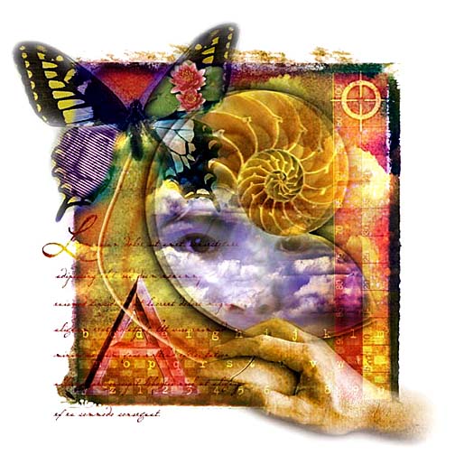
 This is the indesign cover it was made for peachpit press to go on a cd as the main cover. This picture is one of Dianne Fenster’s many photo illustrations. She has used scanned images and original photos to create this surreal eye catching image.Dianne has used: clouds, a butterfly, writing, a face, a hand with a mouse and a shell as the main parts of the image. By putting these images together the meaning has changed and made the whole idea original. All the colours look like ink blots on paper, these look random but there may be a reason for being placed there.There are more colours at the top of the image and the colours graduate out too yellow down the page. The fact that the image is messy and some of the images are off the page makes the image more interesting and the messy outline of the image adds to it all. The composition of the image is very direct and lined up, theres enough images on this that makes it just right. She has used different textures and patterns on the image to push the whole image forward. Dianne Fenster has used a mix of blurred and sharp on the image to make the more important parts show up.
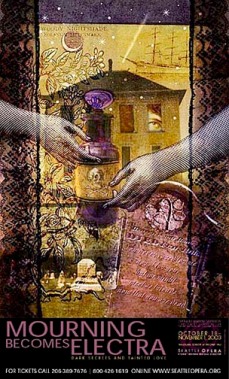
This is the next image it is called Mourning becomes Electra. It was a poster made up of her photography to advertise for Seattle Opera company. All the photos on the picture have been placed purposely to create a new image. The image seems dark and deathly, made up of deep tones of purple blue and black. Even the dull lighting makes i seem moody and dark.The symmetrical pattern on either side of the image makes it look like an opening to the house, which seems to look like the opera house. The foreground images are all slightly transparent, allowing you to see through so you can see every detail in the image and it also makes the hands and the grave stone look invisible and ghostly.When it came to editing all her imaes she used different colours and transparency on all the images to make the colors stand out. This image has more detail towards the bottom and is based in a clean cut shape, so sharp edges and smooth lines. This image is very gothic and suits the title perfectly.
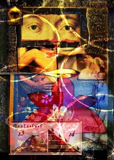
Dianne Fenster has used a mix of dull and bright colours to make out each part of the image. This image is called Parsifal it was also made for Seattle Opera house. This is part of a collection of images that were used in brochures and online as advertising. The top part of the image is quite dark and yellow almost antique made of different parts of a person and a grainy background, all her photos on this area are sharp and contain clean depth. The bottom of the image is made up of plastic looking, bright coloured, transparent shapes. The main image being a pink sanned leaf that catches my attention first. The next image looks like stepping stones or an old pyramid print like an etching. The fact that all these iages are in boxes of there own makes the composition unique and messy. It looks like one big collage of cut up photos. What makes it more interesting is the yellow lines that cut the whole image apart. Its mixed circles wih the rectangle shapes and made it more intresting, if the lines were not there the image might have looked more clean and sharp but adding the lines completed the image making it look more fun and messy.
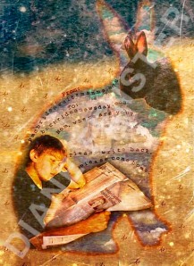
This picture is called 12 again, Dianne Fenster made this for the front cover of a childs book. The rabbit completes the image and makes it more child like. She took a picture of a young girl reading a newspaper, as this book is for children this image seems out of place as newspapers stereotypically are read by adults. You can tell it is based on some sort of extract as the rabbit all so has words based inside it. The background is a very dull blue and green colour which is just a dull version of a meadow. The rabbit has a glowing line around it which makes it look stained and ripped. As the rabbit has no face it doesn’t give it a personality or charecter, its just a shape an outline of the main image. The composition of the image is direct and central and you don’t really notice the background over the middle of the image. She has edited the image and made it look tatty and old with marks all over the background. Also by adding the reflection of people and the black rabbit it makes it look surreal, its hard to understand why you would want a rabbit in a rabbit? But it definitely makes the image more interesting.
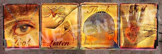
This image is called Look, Listen, Think and Feel. It was used as self promotion for Dianne Fenster to advertise her work. All these images are quite straight forward but have a twist, an example of this would be the feel image as you can feel with your hands and your heart and thats why she has shown a hand containing a heart. She has made all the images yellow so they all link together, and just changed the colour of the rough edge on each image. They all have their own square and it makes them seem like canvas wall art. Dianne has made them look old like she does with all the images. SHe has scanned in images over her own and given them depth, made them eye catching.